Through the course of this article, we’ll take you through why motion graphics have become a staple in web design, and why it is integral to crafting an engaging user experience!
Since animated movies came to the fore in the dawn of the 20th century, the technology that drives animation, visual effects and motion graphics has grown enormously.
Today, motion graphics is an integral part of design across digital mediums, with the field of web design being particularly receptive to the developments in motion graphics.

Check our UI Animation Essentials course.
What is motion graphics?
Motion graphics are, as the name suggests, any visual effects or graphics that have elements of motion or movement to them. It is the backbone of animated films, UI/UX design, text-based promos like infographics and many other visual media platforms. Their purpose, essentially, is to help users by making content easier on the eye, and helps compress complex things into byte-sized, easy-to-consume packages.
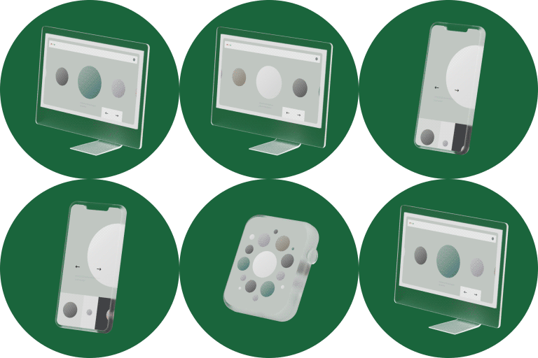
Dribbble: Anton Tkachev — Folio: Designer Portfolio Kit I
How does motion graphics relate to website design?
This is a very simple concept to explain, but one that presents much more difficulty when one tries to apply it to website design! Essentially, motion graphics allows users to process much more information in a simpler, user-friendly manner. Take tech giants like Apple or Samsung, for example – Their websites allow for short videos, GIFs and visual cues to provide the user with all the information they need, rather than a wall of text.
Apart from providing an aesthetic balance to the entire page, this allows users to browse through products and pages at a much more leisurely pace. They are unlikely to be overwhelmed with just text, which is where motion graphics come into play.
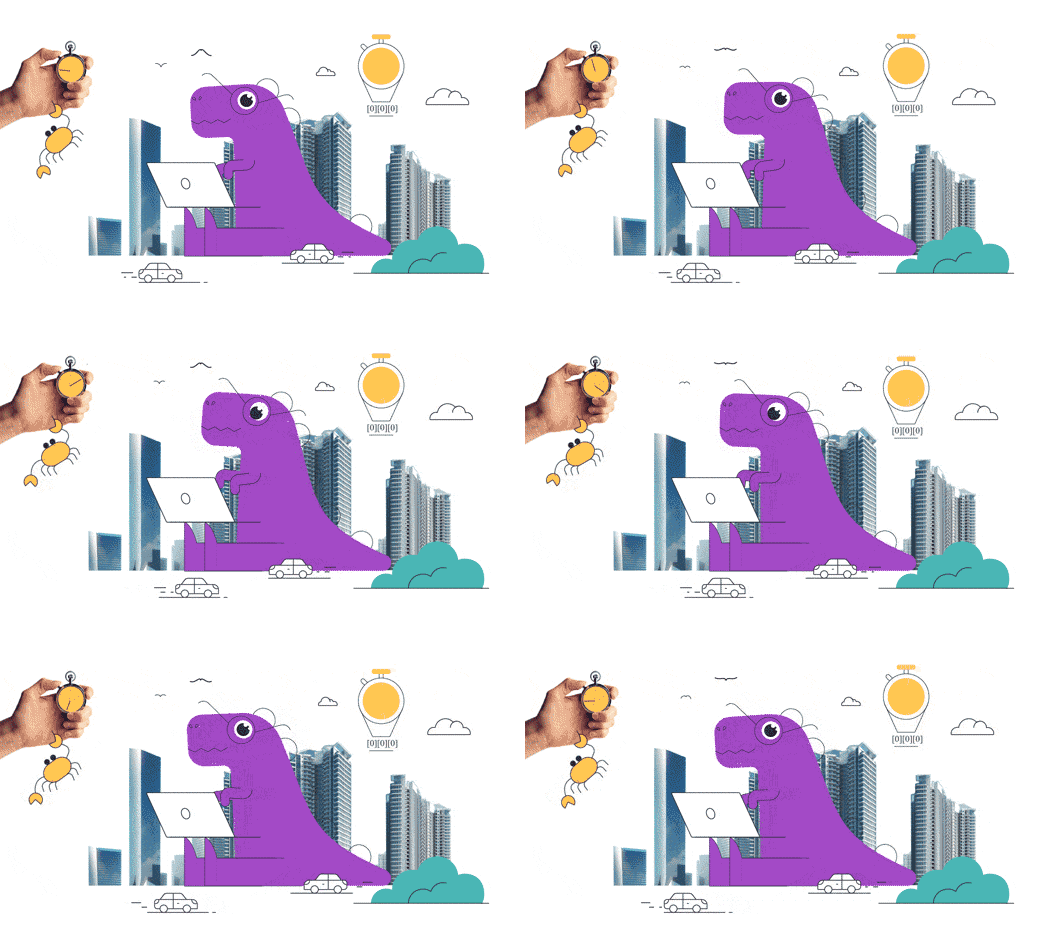
Dribbble: Tran Mau Tri Tam — Stunning_ Animation
Apart from being promotional tools, motion graphics can also play a vital role in the way the user actually interacts with the website. This is particularly true for mobile apps that have supplementary websites. Travel agencies, for example, commonly include motion graphics that liken the user moving from one page to another to a journey on a bus, or add graphics to show reduced fares.
E-commerce sites also do something similar, where they add motion graphics to emphasize deals during the holidays. All of these choices may appear minute on an individual level, but create a unique, wholesome and cohesive experience that impacts the user on a personal level that helps build a connection between the user and the website!
Creating an Emotional Connection with Motion Graphics!
Apart from purely practical reasons, motion graphics can also enhance a website’s ability to build an emotional connection with the user. This is done, primarily, in two ways:
a) Building brand personality
b) Creating striking content.
Brand personality is something that any leading brand needs to establish.
Take Red Bull, for example – their ‘Red Bull gives you wiiiings!’ campaign is a perfect example of building brand personality using motion graphics. This is perfectly integrated into their website at the appropriate pages to help create a cohesive brand personality. As for striking content, motion graphics allows web designers to easily present pain points and ideas that might otherwise require a wall of text. A perfect example is that of product websites, as we mentioned earlier!
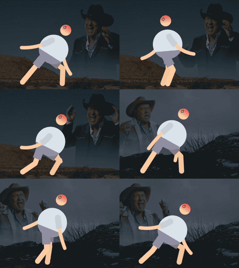
Dribbble: Gleb Kuznetsov — Branding video for milkinside
Crafting a memorable UI experience!
UI, which stands for User Interface, is the physical way in which users interact with your website. This is one such field in which motion graphics may be used to craft a pleasant user experience. For instance, a pleasing sound when a user clicks a particular button on a website, or a seamlessly connected website that zooms between pages in a logical and transitional manner are all examples of great user interface design. Here, motion graphics can play a vital role.
Potent examples include sites like YouTube and Twitch, which allow for subscriber buttons to change from ‘Subscribe’ to ‘Subscribed’ when the user clicks on said button. To undo the subscription, users may simply click the button again, at which point it will change back to saying ‘Subscribe.’This is a powerful and intuitive way in which motion graphics may be integrated into the UI experience!


How do you effectively use motion graphics in web design?
We thought you’d never ask! Well, integrating motion graphics into web design is potentially endless in application, but here are a few common ways in which web designers can take advantage of motion graphics;
Animated Storytelling
Many companies may choose to adopt animated storytelling methods to explain what their brand does, and what they stand for. Infographics, animated shorts, ads, promotional content and social media ads are all excellent applications of motion graphics in web design.
Product Shorts
Product shorts typically occupy a bold, striking and central presence in any product-based web page. As a result, the designer should aim to emphasize the product short, as it allows them to tell a story/explain a product in a way in which the user remains engaged.
Promotional Content
Like shorts, promotional content may be the central attraction of a page, or be used to supplement other elements of a web page. Regardless, they involve motion graphics to help catch the user’s eye, and if placed correctly, can make a world of difference into achieving the website’s goals.
So, there you go! These are some of the reasons as to why motion graphics can be a very powerful tool in crafting memorable websites.
To get started with learning how to apply motion graphics, check out Motion Design School’s courses and get moving!
Want to know more about illustration?
Character Tool — Brand New Rigging Script by Motion Design School
Meet the Character Tool! We developed a versatile script for character animators. It contains functions for rigging characters and adjusting their appearance, workflow boosters and a bunch of secondary motion presets. Character Tool consists of 3 tabs: Rigging, Assistant and Presets. Here is a tutorial on how to boost your workflow with this script: Short overview of general features: […]
Top 3 After Effects Expressions to Simplify Your Workflow
Denys is the Motion Design School’s script wizard and the author of the Expression Trip course. In this article, he will share how to use the most essential expressions that are an indispensable part of any motion designer’s everyday life. Welcome to Expression world! Popular expressions After Effects offers really wide opportunities, but even they are not […]
7 Walking Animation Common Mistakes
Creating a believable walk cycle for your character can be a real challenge. At times it seems that you are doing everything right, but the result is still totally disappointing. You are not alone in this, we know your struggle. This article is a guideline for you to follow to ensure your characters walk as […]


