What can be simpler than logo animation? Well, a lot of things, really, as it’s both a challenge and a chance for a motion designer to make a little easy money. Actually, though, it’ll be easy money only in case you don’t make the most basic mistakes. I’m going to describe the most common ones in this article.
By the way, we’ve recently launched a course on logo animation with a myriad of practical tasks, and now we have plenty of examples and evidence to talk about this matter for real.
I should mention that all the tips and examples in this article apply solely to logo animation. These are short stories for mobile applications, websites or quick YouTube cutaways. In all other cases, such as broadcast openings or animated explainer videos, other rules may apply, and methods of work may be different.
All right, then what are these top ways of improving your animation?
Let’s begin with the first and the least trivial one.
Check our Logo Animation course.
1. A Territory Grab
In the beginning, when you’re still getting the hang of logo animation, you may think that it’s a good idea to use absolutely all of the available frame space. But the truth is, it isn’t. Do your best to use the space of the frame wisely: mark an area around the logo within which things will happen and stick to it.
You need to mark the area taking into account the size of the details in the logo. Try to avoid a situation where small elements are very far apart from each other, like in this picture here:
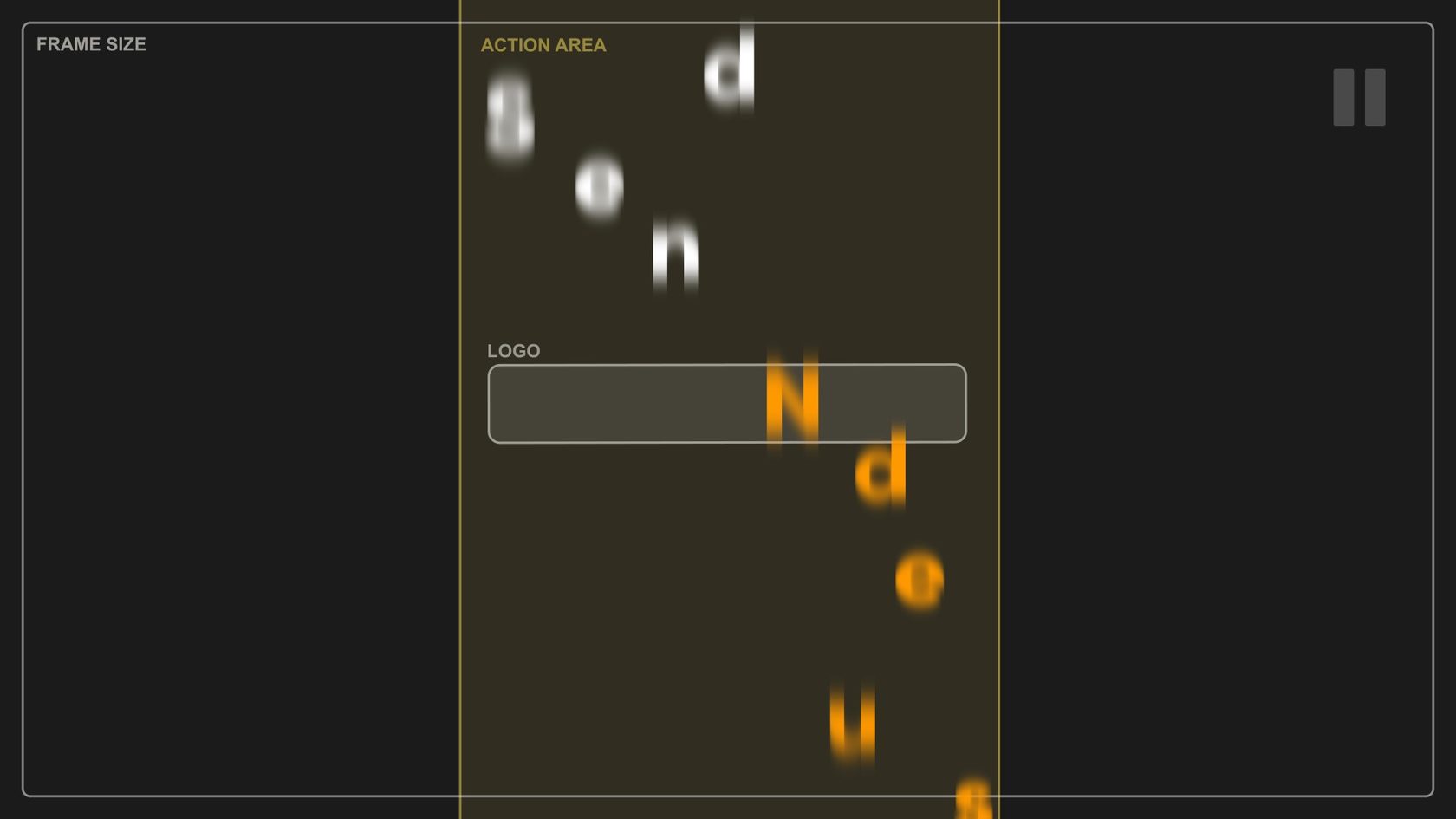
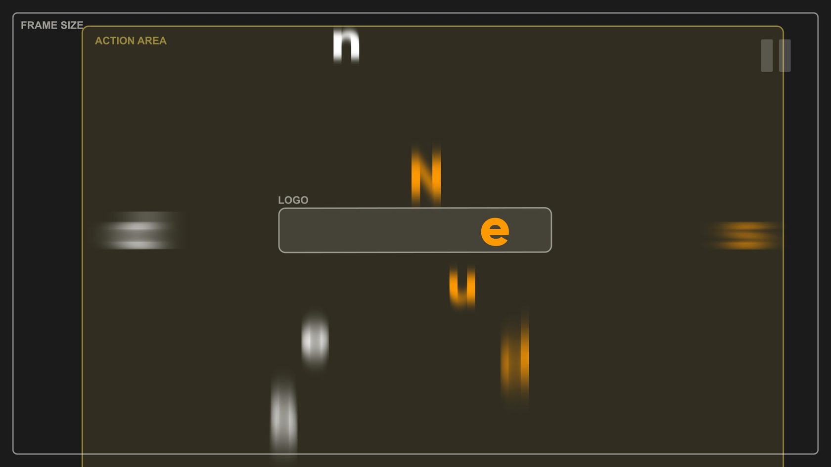
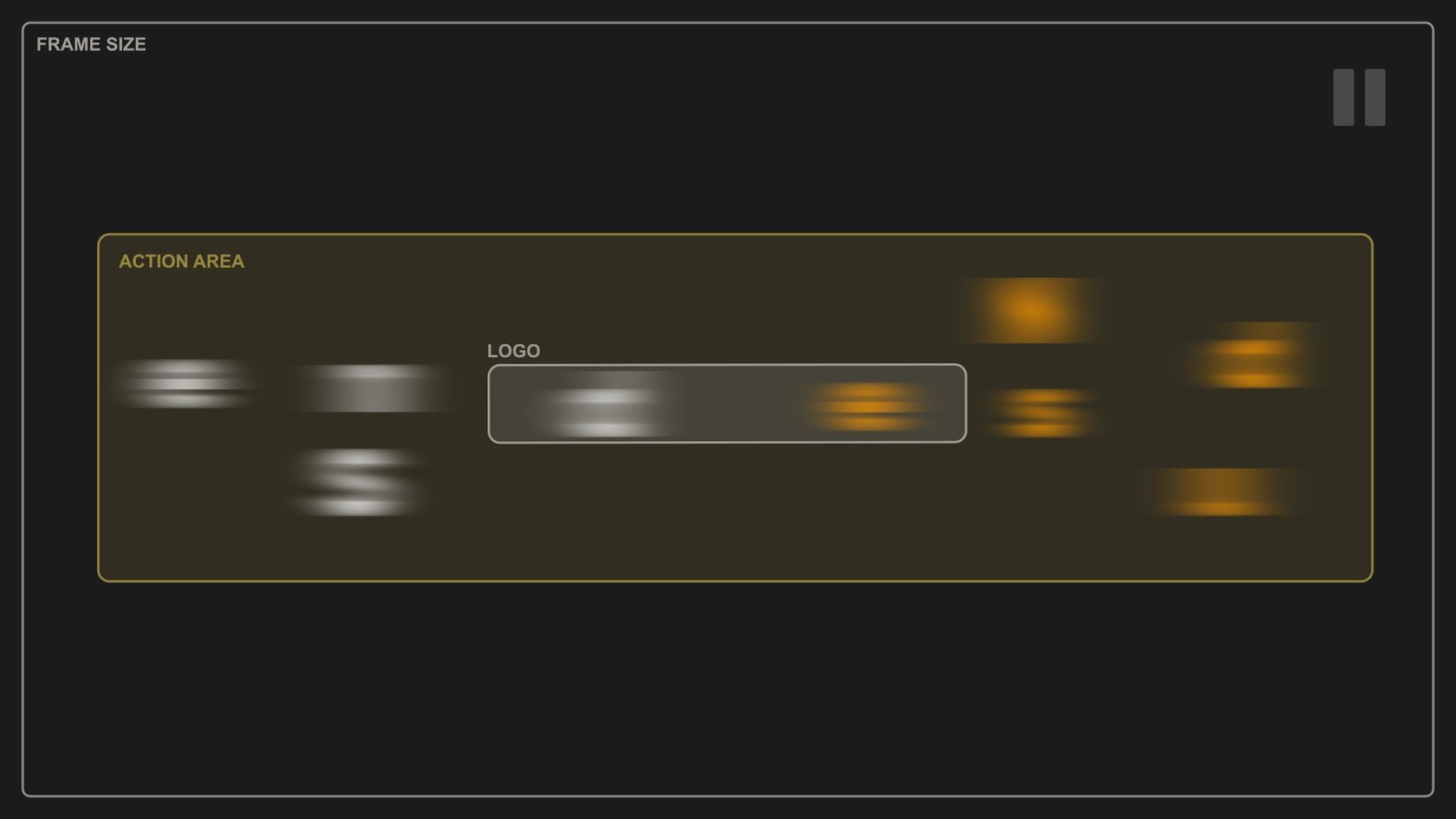
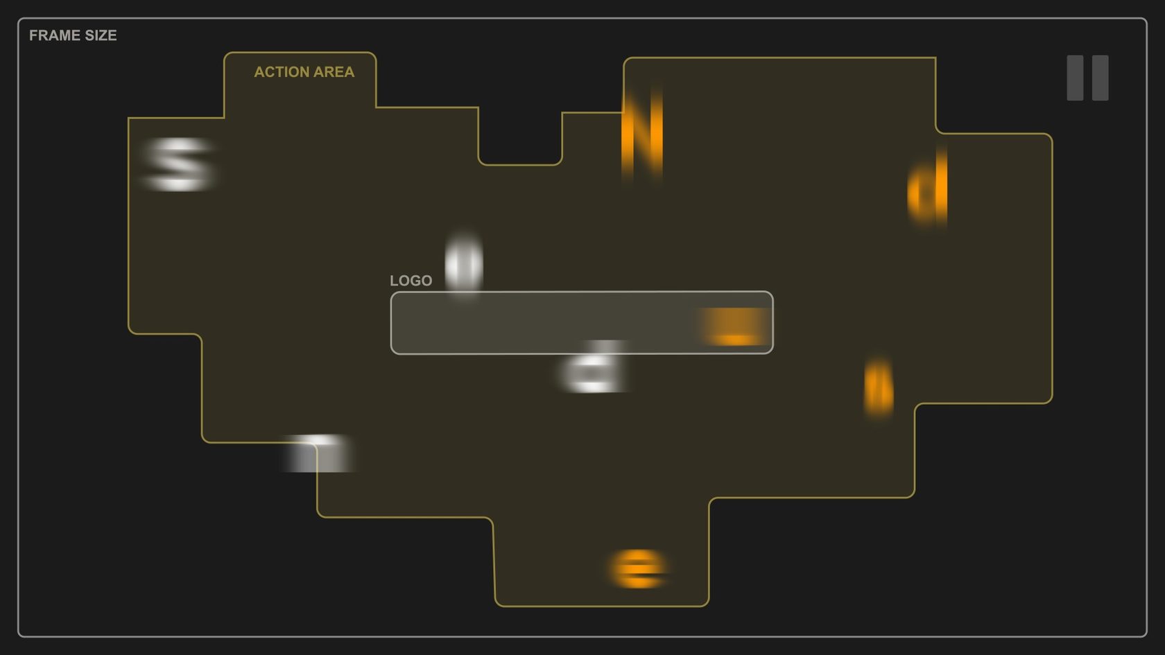
That’s much better:

2. Like a Long and Boring Movie
The second common mistake is an over-long animation. This is mainly due to the fact that it takes a lot of time to create animations. While you’re tinkering with the dozens of objects and hundreds of keyframes, you start having trouble understanding if what you’re doing is good. And over time, it’s getting harder to adjust the animation.


As a result, the animation lacks clear rhythm, “the ebb and flow”, and it’s been lengthened “to demonstrate the excellence of every detail”. I mean, you have so much history together with these letters; they’re like family to you at that point.

To avoid that, start out your work by marking the number of bars or beats that it takes for your logo to be revealed. Plus, clear your head at times, get a cup of tea or work on another scene in the project. This will allow you to get back to work with a fresh pair of eyes and uncover the mistakes made.
3. Mass Effect
When you aren’t yet experienced enough in animation and aren’t so intuitive about the speed and dynamics, this mistake is the easiest to make. If some elements are tossed or hop into the air in your artwork, take a good look at how they behave as they reach the peak of their trajectory.
This is what it looks like:

Does it feel like the letters are getting stuck in the air slightly? If so, then you’ve probably botched up the graph.

To avoid the same mistake, follow these principles when adjusting the speed graphs:
- An object gains speed when it falls, and it slows down when it moves upwards;
- When the object reaches the peak of its trajectory, its speed shouldn’t be zero.
4. Palette and the Smallest Details
If you’re going to animate the logo, you are certainly going to need some elements to highlight the movement or to use in morphing, and so on. How to prevent these things from standing out from the overall style of the logo and to make them organically morph into it?
This is what it looks like:
- Look into the palette you use. Try to stick to the colors of the logo and your client’s company style. That’s really easy.
- Ensure that all the additional elements match the size and the level of detail. That’s not that easy.

In the first place, pay attention to the thicknesses of the lines and the main strokes. It’s also a good practice to pick the biggest and the smallest detail in the logo and compare them with anything that you bring or add to it. This way, you’re certainly going to stay in the safe zone and at least roughly fit in the style.
Or better still, try to use the thicknesses of the lines that there are already in the logo design as the basis.
5. Fan Art
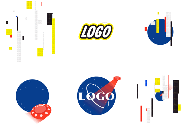
It’s the last and the most frustrating mistake. You make it when you want to illustrate company activities or a product and decide to draw it on your own in the logo’s style. Avoid doing this if it wasn’t you who designed the logo or you’re not a professional graphic artist, as there’s a 99% chance that what you are going to add will be out of style and look foreign.
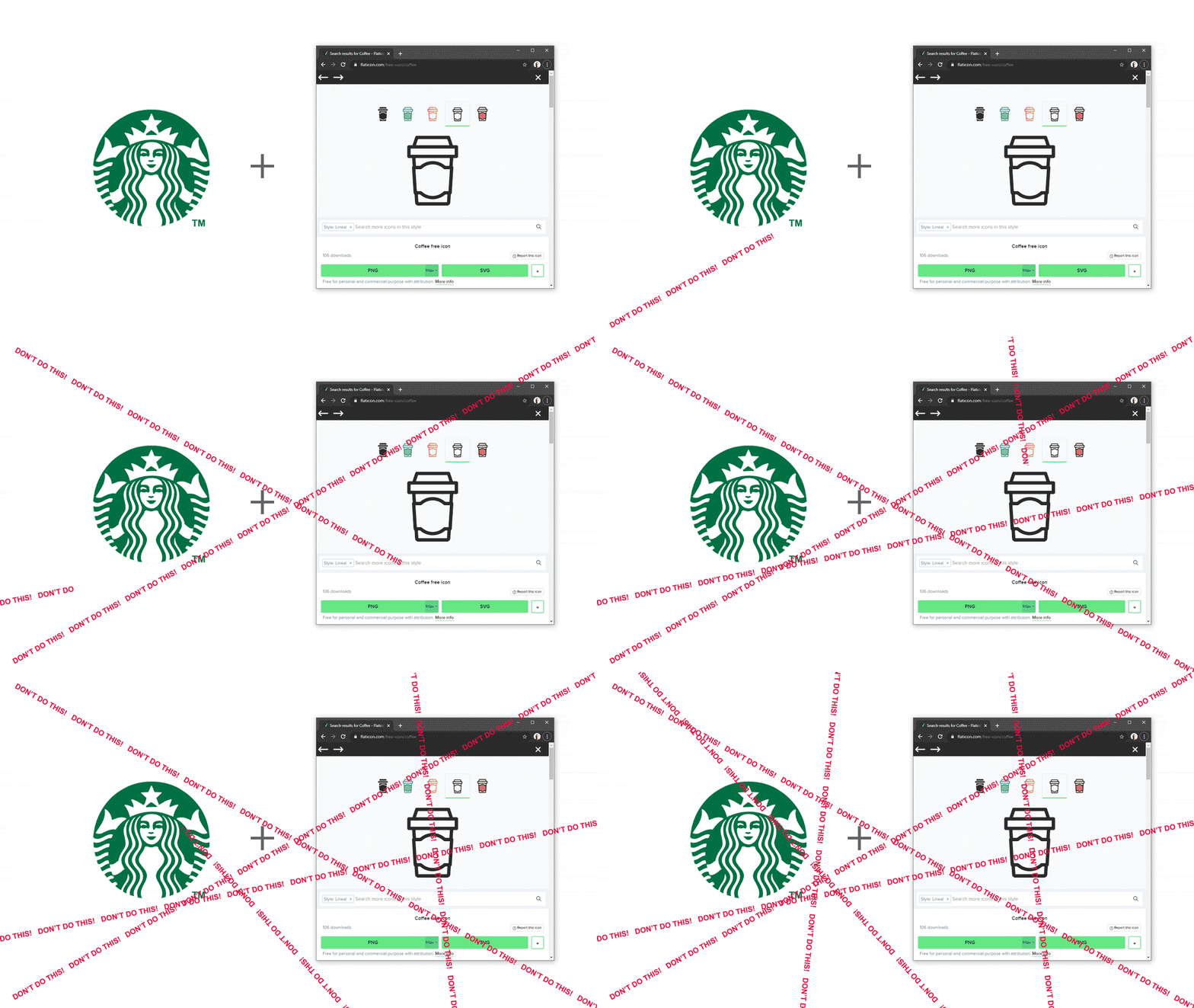
You might think, ‘Obviously, these examples are bad. But I am smart and I’ll do better than that’. No, it probably won’t. If you’re animating someone else’s logo, stick to what you’ve got. Trying to imitate the style of the logo is a slippery slope, and there are almost no successful examples of such additional drawings in the world.
Well, That’s All, Folks.
Let’s tally what you need to bear in mind to create at least a ‘good’ logo animation.
- Let’s tally what you need to bear in mind to create at least a ‘good’ logo animation.
- Start out your work by marking the rhythm and the overall dynamics of the animation in the Timeline. Don’t make the scene any longer than it has to be without artistic need.
- If there are some elements tossed, flying or hopping in your animation, ensure that the keyframes in the peaks of their trajectories aren’t set to 0.
- Make sure that all the additional elements fit in the size and details.
- If you’re animating a logo for someone, try to work with what you’ve got. Don’t create additional icons, people, and so on unless the task requires that.
Create cool animations and tag us with the #motiondesignschool hashtag.
Want to know more about animation?
The Importance of Motion Graphics in Web Design
Through the course of this article, we’ll take you through why motion graphics have become a staple in web design, and why it is integral to crafting an engaging user experience! Since animated movies came to the fore in the dawn of the 20th century, the technology that drives animation, visual effects and motion graphics […]
Speed Lines with Shape Layers in After Effects Tutorial
In this short After Effects tutorial I’ll show you how to easily create tapered speed lines using shape layers without any plugins. This is a pretty popular effect that you can use to convey feeling of superluminal speed, imitating portals and space things or just to add more dynamics to your scene transitions. How to […]
Auto-orient in After Effects
In this quick tip, we will show you how to deal with an auto-orient option in the transform settings in After Effects. Guide to Auto-orient in After Effects Auto-orient is a powerful feature in Adobe After Effects that allows you to automate the orientation of layers based on various parameters. Whether you’re creating motion graphics, […]


