The animation of interfaces in motion design has specific characteristics of its own that beginners should know about. This will help you gain a better grasp of the tasks and the design process, and avoid making common mistakes in your work.
Let’s look at the three tips that will help you show who’s the boss.

Check our UI Animation Essentials course.
1. Create Wisely
Before animating an interface, ask yourself: ‘What kind of animation is it better to use to solve the assigned task?’ Let’s use the extremes here and divide the animation of interfaces into two types: functional and conceptual.
Functional Animation
Functional animation is the minimum of animation, which means that every movement and change in the interface solves a specific problem. There’s no place for entertainment and endless waiting for the animation to end.
Your animation is functional if:
- you don’t use complex effects;
- you don’t use more than 1 or 2 basic transformation properties (Position, Scale, Rotation and so on) in one action;
- your animation looks natural and users don’t notice it;
- your animation doesn’t make programmers cry.
It doesn’t mean, however, that this kind of animation is easy to create. Carefully think through the rationale for each of your actions to achieve natural animation that will help users as well as make the product better. Ideally, you should stick to the guidelines and common interface requirements.
Let’s move on to the opposite kind of interface animation.
Conceptual Animation
When creating conceptual animation, you can stretch the rules. It can be unusual, spectacular, and extremely difficult to implement in code. Such interfaces often remain at a prototype stage or get simplified to a great extent.
Feel free to create conceptual animation if:
- you need to impress your audience or investors;
- you want to demonstrate new and original interface interactions;
- you want to make an impressive portfolio to attract customers;
- you crave for programmers’ tears, mmm yummy.
Conceptual projects do not always remain at a prototype stage, and such platforms as awwwards and dribbble provide many good examples of such animations. The FUI (futuristic user interface) is the embodiment of abstract and conceptual design, which is used in cinema, advertising and exhibitions. Unfortunately, in real life, such interfaces are useless.
2. Make it Simple
After you decide on the type of animation you need and get to animating, I suggest you follow these three approaches.
Simplify
Beginners often try to apply newly-acquired knowledge straight away. And it’s only natural as the more tricks you’ve recently learned, the more you want to use them all at once. It’s okay to do that when you are practicing and experimenting, but hold your horses when it comes to work.
Don’t be afraid to say no to unnecessary techniques and effects. Double-check the article on animation trends you’ve recently read: it may already be outdated.
Simple Doesn’t Mean Fast
If you don’t have enough experience, even simple animation is not as easy to create as it seems. The common problem beginners face is that they finish their work after designing just a couple of concepts, and these may not be the best solutions.
Don’t fall into the trap of perfectionism, however, as you can redo your artwork forever and never see it in its final form.
Here’s a simple tip. Don’t spend too much time on rough animation as it’s better to make more iterations and variations. You will definitely find the best idea among a number of them, or create the best thought-out version from the existing ones.
Make Your Animation Faster
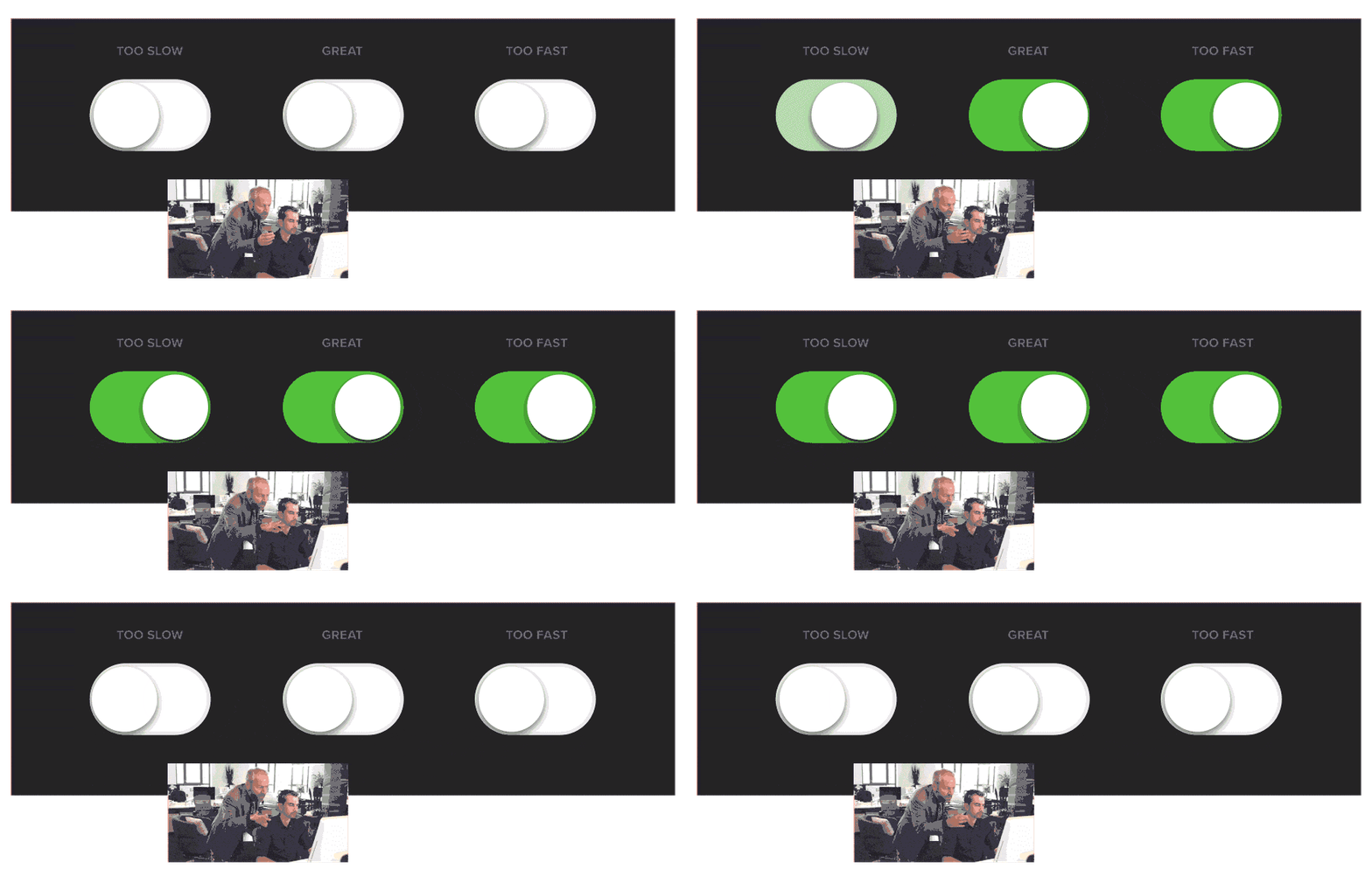
It’s not easy to find the right timing of an animation. Beginners tend to create animations slower than they should be because they want to demonstrate their animations in every detail. So just bear in mind that your animation should probably be approximately 30% faster than it already is.

If you’re unsure of the timing, use the ready-made Material Design guidelines https://material.io/design/motion/speed.html#. As you gain more experience, you will easily see which pieces of your animation need to be slowed down and which ones need to be sped up.
Tip
Once you arrange the keyframes of your animation and adjust easing, try to specifically move the keyframes along the Timeline to speed up or slow down your animation to find the best solution. Sometimes, the desired result that can change user experience is just a few frames of animation away.
And if there’s too much of animation happening on the screen to adjust it all manually, then pre-comp them and use the timeremap function to adjust the speed of the entire animation with one property.
3. Learn to Present Yourself
After you’ve implemented all your ideas and you’re happy with how you did that, you should think about how to present them and share them with the world.
A few more questions for self-check. What is the platform you’re designing the interface for? Is it a monitor, a smartphone or the VR technology? By adding your interfaces to mockups, you add context. Just as it is important to choose a suitable frame for a painting, it is also important to choose a good context for your interfaces.
Mockups are a good tool, still use them wisely. In the first place, mockups are needed to demonstrate and to complement your interface. Don’t overuse them in your portfolio. For instance, use mockups in large presentation layouts that reveal all parts of your interface. If you’re demonstrating your interface in a small format, such as an image in dribbble, make sure that your mockup is large enough to see what’s happening in the interface itself. But still, it’s your interface that is important to the audience and not a nice-looking mockup.
Checklist for Your Animations
We’re done with the tips, so let’s run through the main questions for your self-check. If you want your artwork to meet your own and your users’ expectations, go through the checklist:
- Before animating the interface, decide on the type of animation. Will it be a functional or conceptual one? Or maybe both should be combined?
- Do you use unnecessary effects or outdated techniques in your animation?
- What if you try animating it with a different approach?
- Will your animation be improved by speeding it up or slowing it down?
- Where can your artwork be published? Choose the right mockup to suit a specific platform. If the interface gets lost, then better don’t use a mockup.
Want to know more about animation?
Top 5 time-saving Extensions for After Effects
If you animate your works in After Effects and still don’t use the extensions I’m both happy and sad for you. Read this short article till the end and your life will never be the same again. 1. Overlord Preparing source files for animation is one of the most time-consuming phases of the animator’s work. […]
Blending Modes in After Effects
In this Very quick but very useful, we will know how to use blending mode. Just use difference mode and here you are ? Blending Modes in After Effects In Adobe After Effects, blending modes are used to control how different layers or elements interact and blend with each other. They determine how the colors, […]
4 Advanced After Effects Expressions Made Easy
Denys is the Motion Design School’s script wizard and the author of the Expression Trip course. In this article, he will share how expressions can be used to create more complex animation. Popular expressions As you’ve learned from the previous article on top 3 After Effects Expressions to simplify your workflow, programming in After Effects, besides being […]


